I’ve been getting used to a new piece of data visualisation software and in the middle of last season stumbled upon an idea I’d had, about how goals scored (and conceded) were distributed throughout the 90 minutes of a game. Graham Westley was supposedly famed for having teams that would be fit enough to last to the end of the season and perform better in the latter stages, but what about within games themselves? Do sides have a habit of scoring more goals in the first half than in the second? Are they great at defending for 80 minutes and then let the floodgates open in the dying moments?
And it’s led to something I’ve found to be quite fascinating, but requires a short explanation, so first please allow me to build up a picture. The following chart shows the number of goals scored by Boro’ (in blue) over the course of the 2010/11 season, Boro’s first in the Football League, grouped into five minute chunks. That is to say that the left-most blue bar counts the goals scored in the first five minutes (there were two), the next bar shows how many goals were scored between then and the tenth minute and so on.
The red bars hanging down represent the goals that were conceded during those same five minute intervals. So between the 5th and 10th minutes of league games that season, Boro’ scored eight goals and conceded just one. So far, so straightforward, and you can pick out various other features if you so wish:

Goals Scored in Boro’ League games during 2010/11 regular season, grouped in five minute intervals
Where this led to, however, was a thought around how those sets of bars relate, and what happens when you consolidate them over time. To the naked eye it appears that Boro’ significantly outscored their opponents in the first half but then things evened out a little in the second half. But how to depict that in the chart without requiring the reader to pick it apart? Well, instead of considering two sets of bars, why not one? To that end, I repeated the exercise, but just looked at the difference between goals scored and conceded in each of the periods.

Goal Difference in Boro’ League games during 2010/11 regular season, grouped in five minute intervals
Examining this chart crudely, it’s evident that there were more five-minute intervals where the Goal Difference was positive than when it was negative, and a couple of particularly big spikes early on. Translating that into what it meant in footballing terms, Boro’ were definitely scoring more goals than their opponents in the first half, and broadly the same number in the second half. The visualisation still falls a long way short of telling a complete story, though, as we end up having to spend some time interpreting the data and performing some manual arithmetic to make sense of it all.
What would be much clearer would be a cumulative total – we can see that Boro’ outscored their opponents by eight goals in the first ten minutes with some simple addition, but to work out the equivalent number ove, say, 60 minutes takes time and gets dull very quickly. So, here’s that same chart, but instead the bars represent the cumulative goal difference since the start of the game. The numbers at the tip (or base) of each of the bars indicate the goal difference at that point:

Progressive Goal Difference in League games, 2010/11
Remember that this consolidates all 46 games over the course of a league season, but by doing so we get a generalised picture of how Boro’s games went in that spell. The story here is that they were effective at getting ahead within the first half an hour of games, and then were even more effective at holding on to that lead. Their goal difference at 30 minutes in was +17, and was the same at full time, an hour later.
Obviously, seasons in which Boro’ have had a positive goal difference are generally more successful and see them winning more games, but there are many ways to skin a cat. The following season Boro’ ventured into League One and made another dash for the playoffs, also with a healthy positive goal difference, this time of +25. The profile, however, differed greatly to that from the previous season – an hour in, Boro’ were generally scoring as many goals as they conceded, but in the final half hour of games totally dominated, scoring 20 more goals than they conceded:
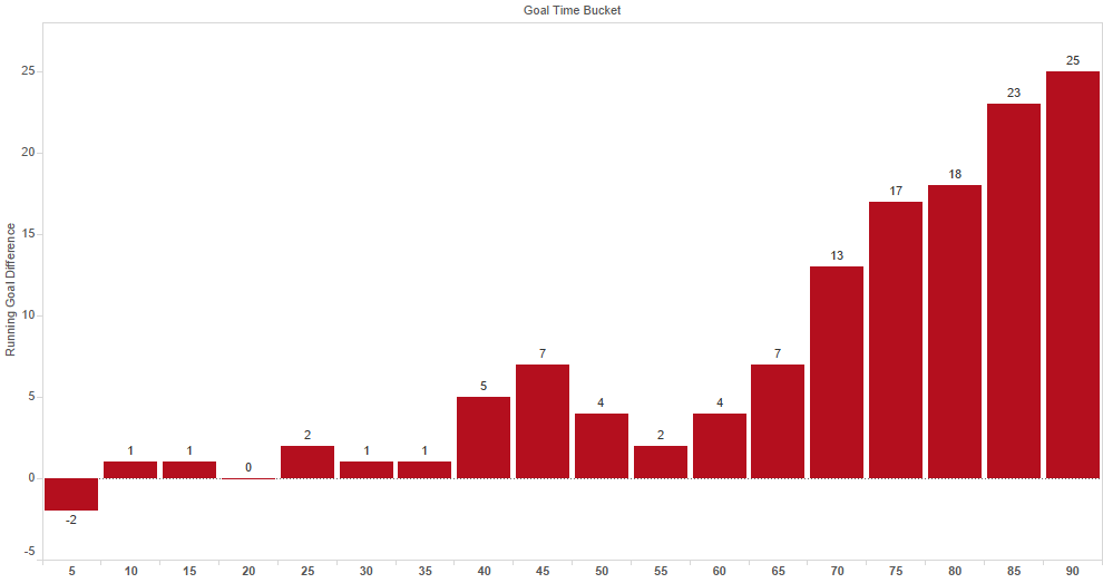
Progressive Goal Difference in League games, 2011/12
As alluded to earlier, Graham Westley’s sides were known for having the stamina to improve as the season went on, but not much was said about this side’s endurance within games. Westley departed just over halfway through the season, but had clearly imposed some superior fitness in those players.
The following season (12/13) saw significant transition as Gary Smith took his side towards the top of the table in the early months before fading rapidly as the season progressed and closing out in a lower-mid table spot. With a final goal difference of -16 the chart looks much different, as you’d expect, but is almost a mirror image of the previous one, with only a difference of -5 in the first hour and some serious fade as games reached their conclusion. The squad had featured a serious overhaul in that period, and little of that staying power transferred from one season to the next.

Progressive Goal Difference in League games, 2012/13
By 2013/14 Westley had returned again, but saw his side miserably relegated. This time the deterioration was worse – Boro’ were generally in their games until half time but then capitulated quite gradually. Were we to see a perfectly consistent drop as the minutes passed we’d be able to argue that there was little profile to the way games were played out at all, but as we can see Boro’ were certainly hanging on until the latter stages of the first half before the rot set in.

Progressive Goal Difference in League games, 2013/14
As Boro’ then returned to League Two, Westley took one final shot at success and hauled Boro’ into the playoffs in 2014/15, with a relatively featureless season in terms of goal distribution. There was still a positive surge in the final third of games, but not nearly as significant as in previous seasons. You’ll notice a few peaks and troughs, but those peaks are relatively low compared with the earlier seasons:

Progressive Goal Difference in League games, 2014/15
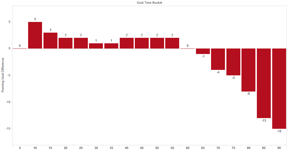
And, finally, the most recently completed season saw a combination of Sheringham and Sarll flirt with relegation. Once again, however, the swing towards a negative goal difference took hold relatively late in games. Incredibly, after an hour they were level with their opponents, scoring exactly as many as they conceded, yet shipping 15 more than they netted in the final half an hour. This would really represent the opposite of that first League One season, where fitness could well have told late in games and in spite of a positive start, Boro’ really faded when it mattered most.
Progressive Goal Difference in League games, 2015/16
Six Football League seasons then, and six quite different experiences, borne out by the charts presented above. To save scrolling up and down the page to compare between them, here the are once again in a single gif, this time scaled to the same y-axis:

Rolling Goal Difference progression 2010/11 – 2015/16
If you’d like to share this gif, it’s posted to Twitter here.